
Apple Logo Evolution, It all Started With a Fruit. Despite carrying the name Apple, the company’s first logo didn’t describe the physical shape of an apple.
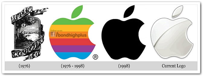
The Newton Crest: 1976-1976
The first Apple logo was designed in 1976 by Ronald Wayne, sometimes referred to as the third co-founder of Apple. The logo depicts Isaac Newton sitting under a tree, an apple dangling precipitously above his head. In addition, the phrase on the outside border reads, “Newton… A Mind Forever Voyaging Through Strange Seas of Thought … Alone.”
The Rainbow Logo: 1976-1998
Not surprisingly, the above logo only lasted a year before Steve Jobs commissioned graphic designer Rob Janoff to come up with something, oh I don’t know, a little more modern. Janoff’s eventual design would go on to become one of the most iconic and recognizable corporate logos in history.
According to Janoff, the “bite” in the Apple logo was originally implemented so that people would know that it represented an apple, and not a tomato. It also lent itself to a nerdy play on words (bite/byte), a fitting reference for a tech company. Quick side note: Corporate design sure was a lot simpler in the 70s.
Nowadays, companies like Pepsi spend millions of dollars on logo re-designs that are based on complete BS and new age mumbo jumbo. As for the rainbow stripes of the logo, Steve Jobs is rumored to have insisted on using a colorful logo as a means to “humanize” the company. However, Janoff has said that there was no rhyme or reason behind the placement of the colors themselves, noting that he wanted to have green at the top “because that’s where the leaf was.”
The Monochrome Logo: 1998 – Present
Tinkering with one of the most recognizable logos in the world wasn’t done simply because Steve Jobs is always looking to change things up. When Jobs returned to Apple in 1997, the company was bleeding money, and Jobs and Co. realized that the Apple logo could be leveraged to their advantage. That meant experimenting with larger logos to make it more prominent. If the shape of the Apple logo was universally recognizable, why not put it where people could see it?
Why Apple had to abandon the rainbow logo
Finally, the rainbow logo just wouldn’t fit on the iMac pictured to the right. Rainbow on beige? Alright. Rainbow on metal? Not so much.
If you liked this article, then please subscribe to our Blog for more updates like this. You can also find us on Facebook, Instagram, Twitter, Pinterest, LinkedIn and YouTube.
